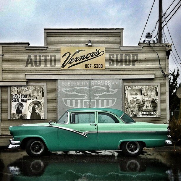
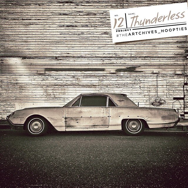
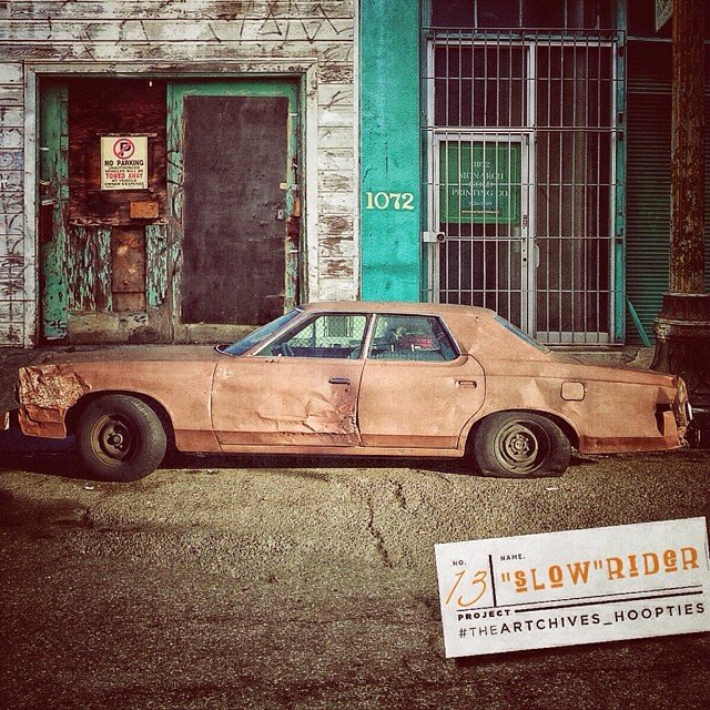
Vernor’s Sub Quality Repairs


Project: Hoopties | @theARTCHIVES | #TheArtchives_Hoopties on Instagram

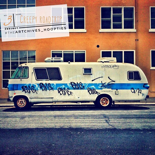
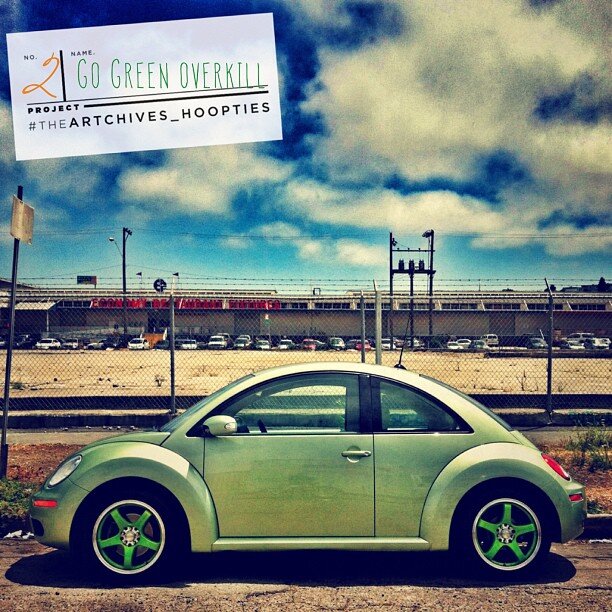
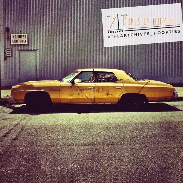
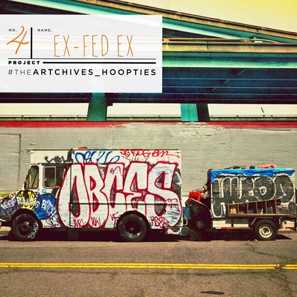
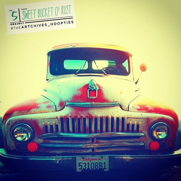
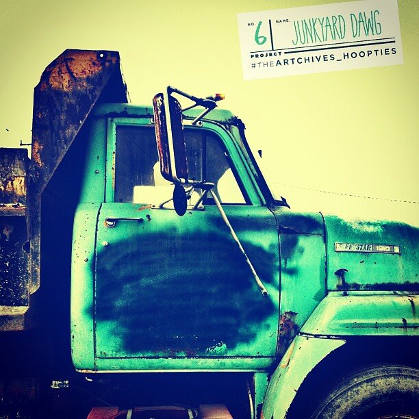
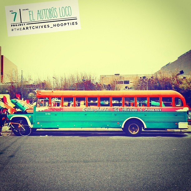
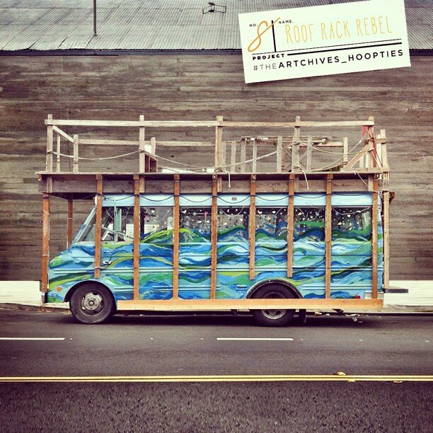
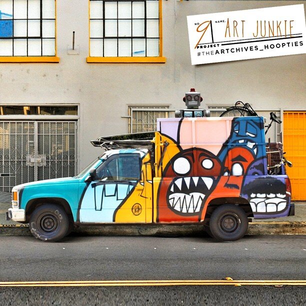
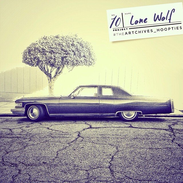
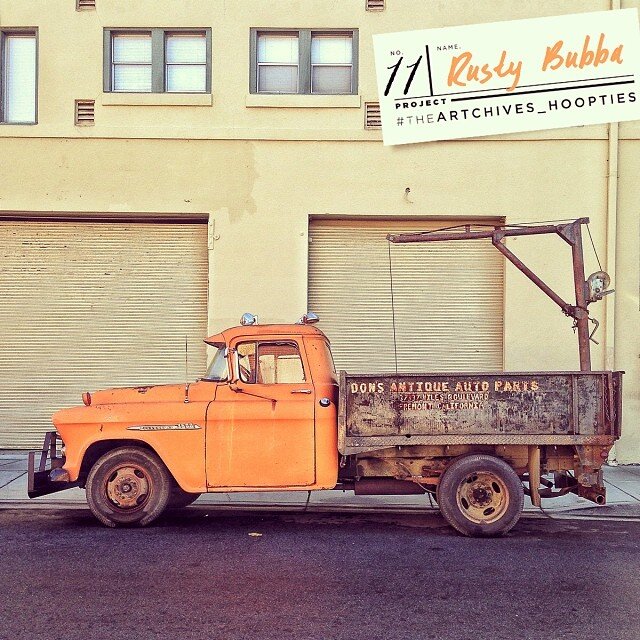

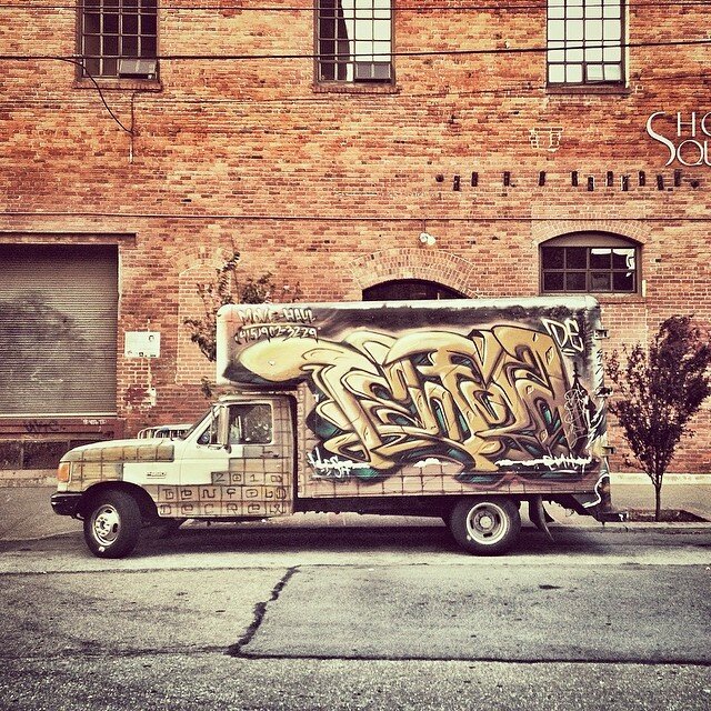
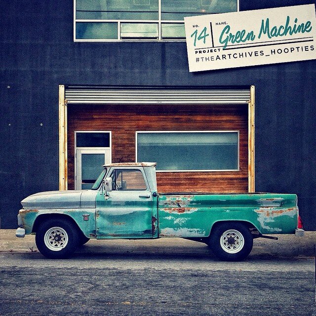
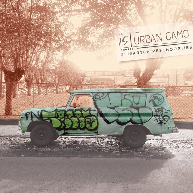
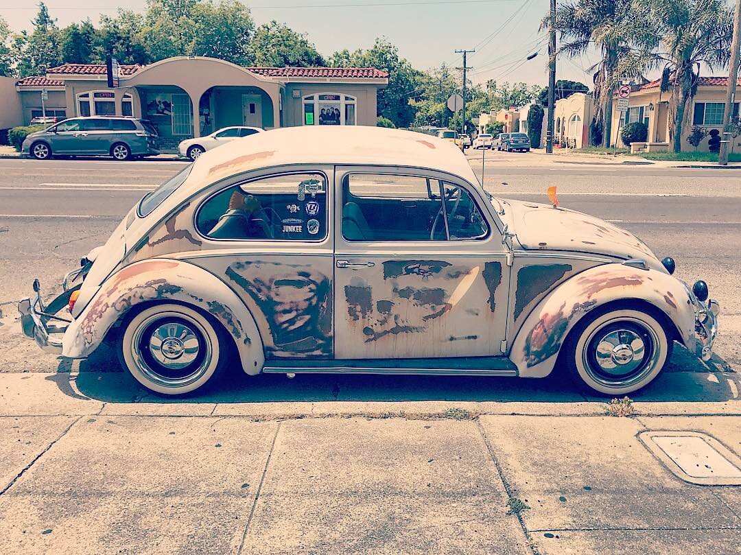

Twenty20.com (formerly Instacanvas) hosted their first gallery show at the Hamilton Gallery in Santa Monica, CA. showcasing the work of photographers, designers & artists. It was an extreme honor to be invited to showcase my work. A cool highlight of the night, during the pre-gallery set up, I was able to meet up and exchange ideas with Skate Icon & Legend Tony Hawk. To this day, I am not sure how all these events came together. The art piece that I was showing is an eclectic visual mashup of personal photography, 1980’s, my own brand of humor and admiration for the many outlandish “hoopties” parked all over the SF BAY AREA. During my creative process I decided to include an iconic late 80’s skateboard meme from my childhood. Few people will even get the reference. Tony Hawk spotted “Animal Chin” right away. LOL.

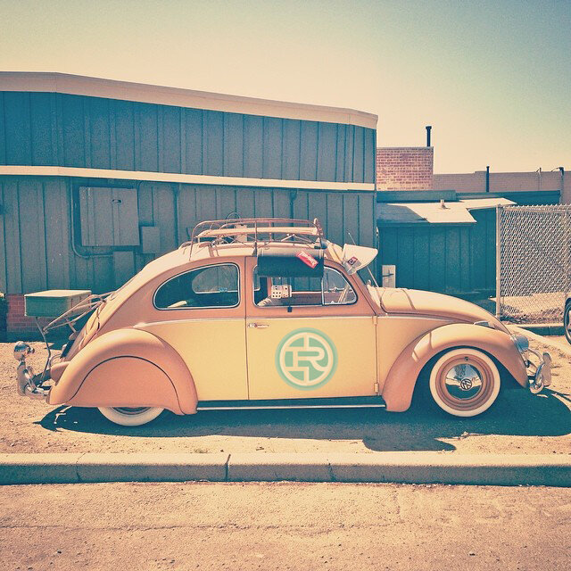
Project: Type vs. Time | @Type_vs_Time | #TypevsTime
The Type vs. Time concept began many years ago, when I discovered the incredible Japanese aesthetic philosophy, Wabi-Sabi. In Leonard Koren’s book, Wabi-Sabi: For Artists, Designers, Poets & Philosophers, he states Wabi-Sabi finds “beauty in all the marks that time, weather and use leave behind." This statement resonated with me. In my opinion, Wabi-Sabi was the perfect counter-balance to the fundamentals that all graphic designers embrace: the doctrine of swiss precision, Bauhaus clean geometric forms and balanced visual composition. I was drawn to the idea that regardless of how perfect and masterfully something was crafted, time always imposes its marks. Any well-trained designer will painstaking obsess over kerning and leading Type. He works then reworks his designs until it so communicates clearly. But the designer cannot protect from the force of Time. Time waits patiently and eventually smothers your once pristine design with its beautiful imperfections. This phenomenon celebrates the imperfections of life, and I began finding beauty in the most curious spots: weathered signage, dilapidated buildings and worn sidewalks. I began seeing objects, not in their current state of existence, but appreciate them for their position within the process of time. { @Type_vs_Time + #TypevsTime on Instagram }
Read about my Project Type vs. Time and other type and design related projects in The New Yorker article:
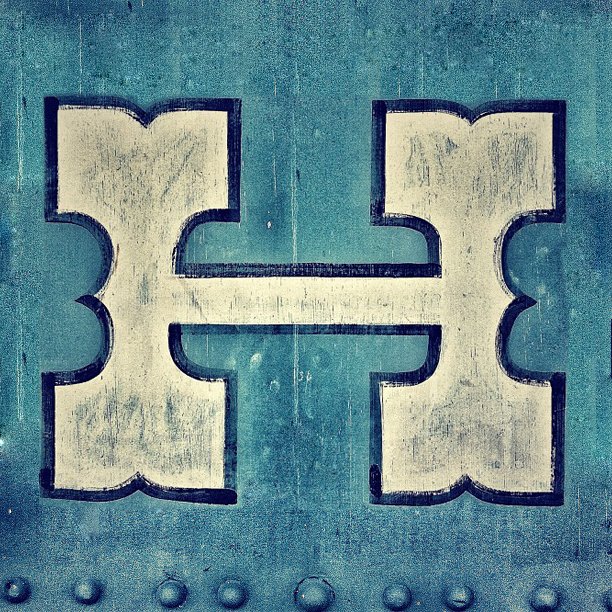
#TypevsTime is an Instagram based #hashtag project that showcases Time-worn Typography & Lettering on distressed, weathered & imperfect surfaces:


Allan Peters is a senior art director at Target who also writes a popular blog highlighting his own work and the work of designers whom he admires. On a section of the site called Badge Hunting, Peters catalogues images of vintage badges—the sections of packaging or signage with a company’s name and logo—that he finds at antique stores, state fairs, museums.
Badge Hunting is one of a number of idiosyncratic online showrooms of typography sourced from objects in the real world. For all their sophisticated tools, many designers get ideas from graphic artists who worked before computers, when all type was laboriously set by hand rather than formulated digitally. (You can see the influence of vintage typography in the logos of many modern companies, including the one for Target’s Threshold line of furniture and housewares, which Peters designed).
Jonathan Lawrence, a twenty-eight-year-old designer from Atlanta, told me that he often spends entire Saturdays hunting for new objects for his site Type Hunting, which features everything from old padlocks and coffee cannisters to matchbooks and train cars. Type vs. Time, the Instagram account of the Bay Area-based designer Ryan Herras, features the weathered lettering on signs and objects, most recently a series of old containers of everything from shoe polish to cinnamon to cold cream. His focus on timeworn type, he wrote in an email, was inspired by the Japanese aesthetic of wabi-sabi, which emphasizes the beauty of impermanence and imperfection. Street Type, the site of twenty-six-year-old Brooklyn designer Joe Geis, focusses on signage from stores and restaurants, both thriving and defunct.
Some of the objects catalogued on these sites feature the logos of familiar brands—Kodak, Coca-Cola, Peter Pan peanut butter—but most are esoteric, and one of their pleasures, aside from the type, is the eccentric brand names: Tampa Nugget safety matches, Wolverine Laundrette, Head Chop Hairs & Wears. Some of my favorite typefaces are the ones that feel incongruous with the products they’re promoting: Type Hunting features a toolbox logo in ornate cursive, and a salad-dressing label as stark and functional as a toolbox.
For those of us who aren’t design connoisseurs, found-type blogs can provide a momentary sense of what it’s like to be out into the world with a typographer’s eye. Above is a selection of images, accompanied by comments from the Web-site curators on why they found each object noteworthy.
Rachel Arons is the deputy culture editor of newyorker.com.

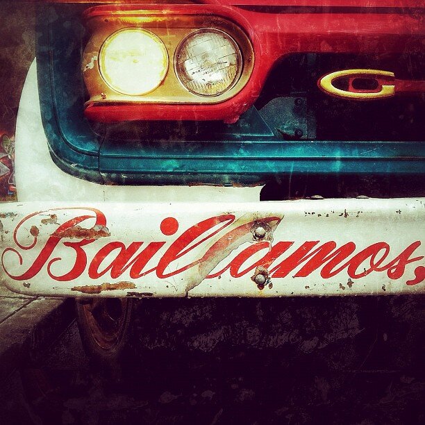
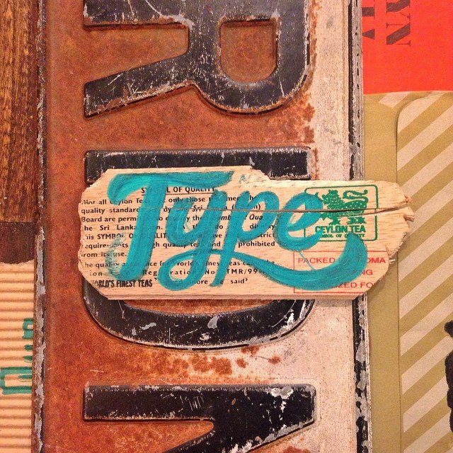
“Brush lettering alone is an incredible art. In this image, its beauty is still apparent on the tattered, scratched, and grimy surface.”

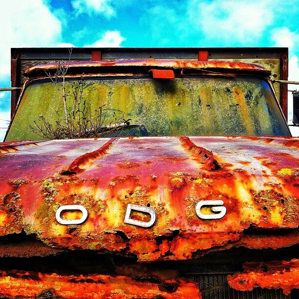
“This image illustrates the Type vs. Time concept perfectly. I’m intrigued by the way the passing of time has overlaid an artistic splintered texture, rising from the bottom and reaching to envelop the capital ‘O.’”

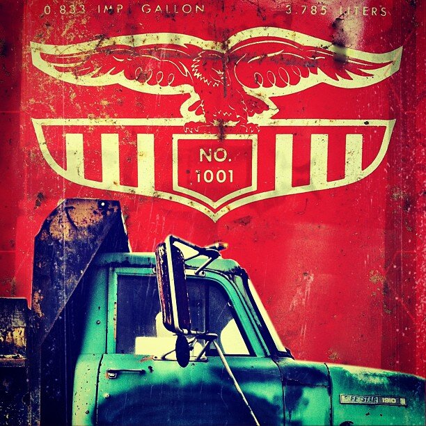
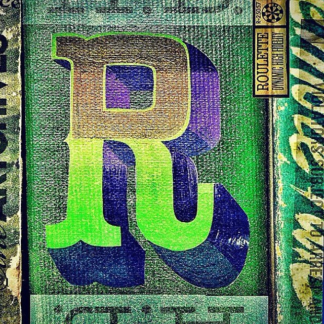
“Today, packaging trends are leaning towards the unadorned—there’s a desire to strip away all heritage cues for a more minimal and pared-down look. Every time I find an old package like this one, its typographic personality and visual charm hold my attention longer than any modern version.”


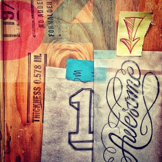
Project: TYPOGRAPHIC MASHUPS & COLLAGE
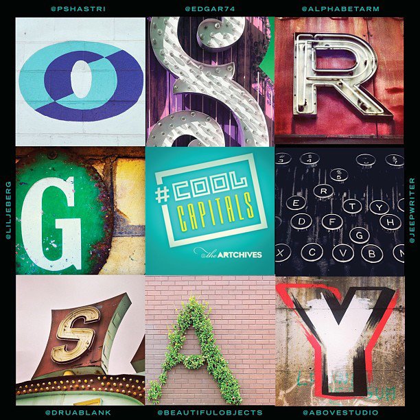
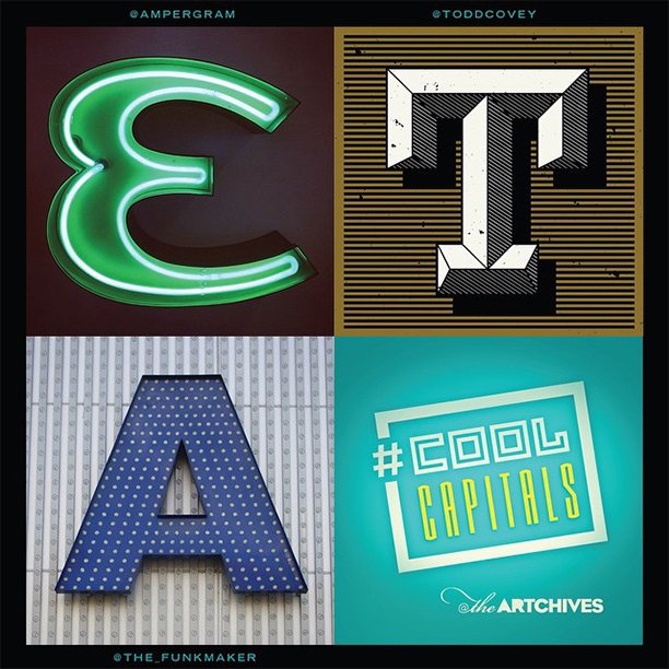
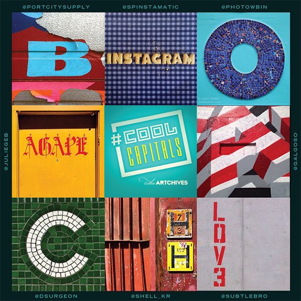
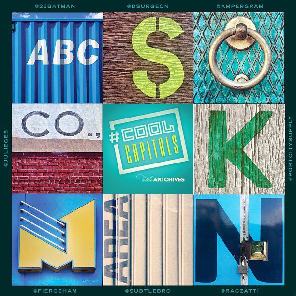
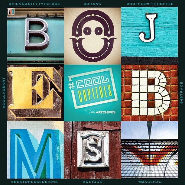
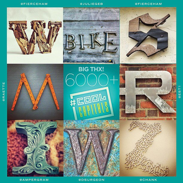
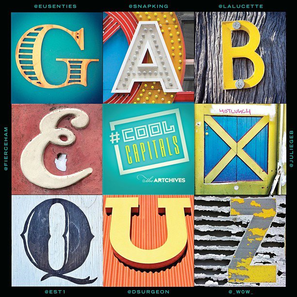
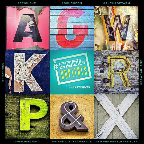
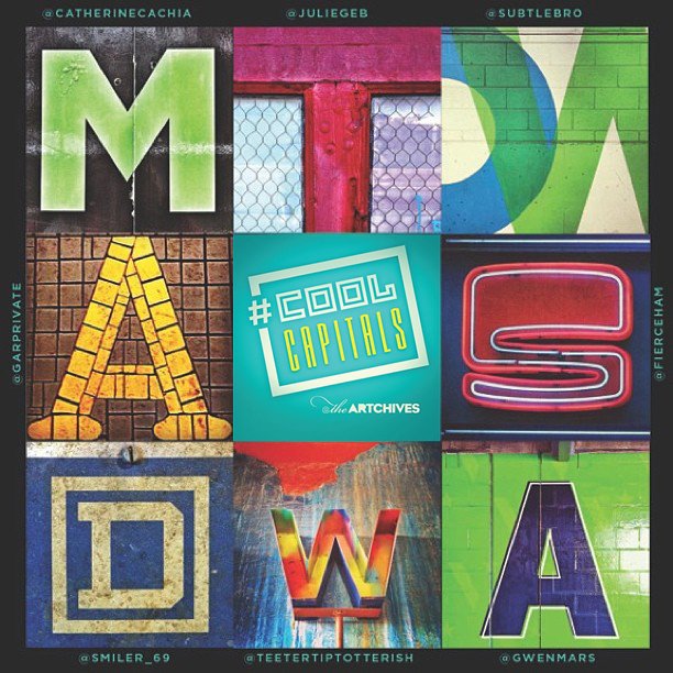
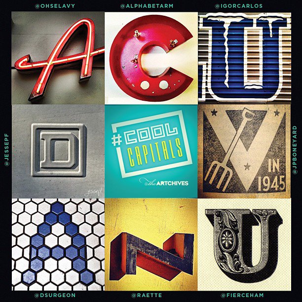
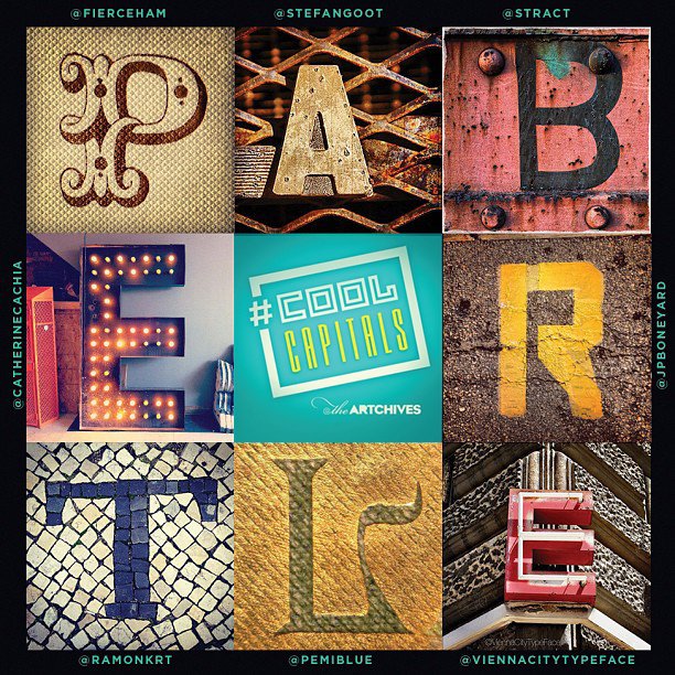
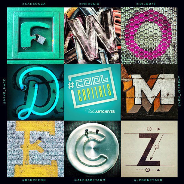
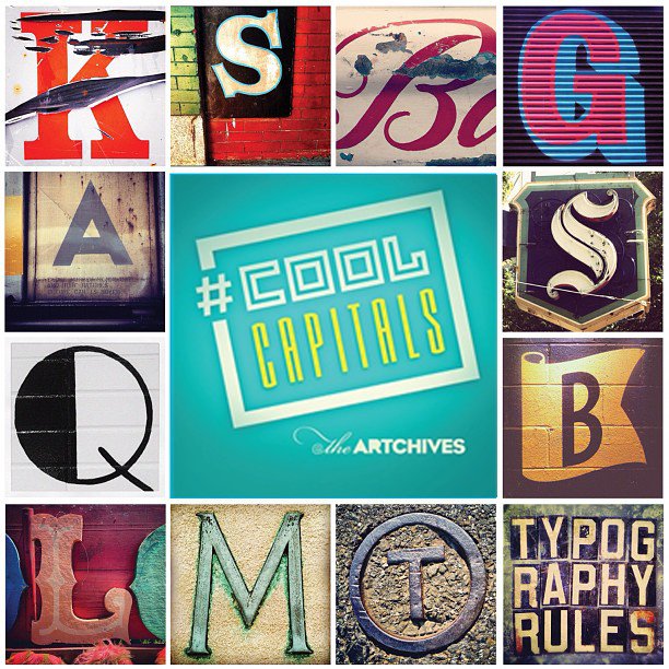
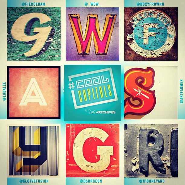
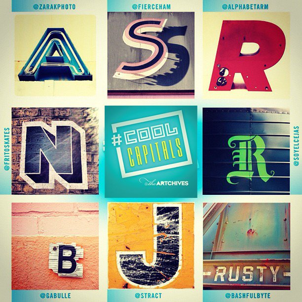
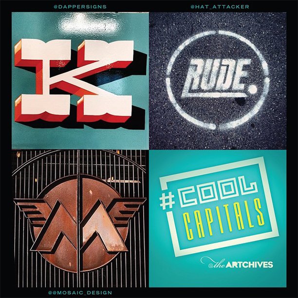
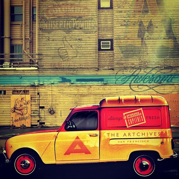
Project: #COOLCAPITALS